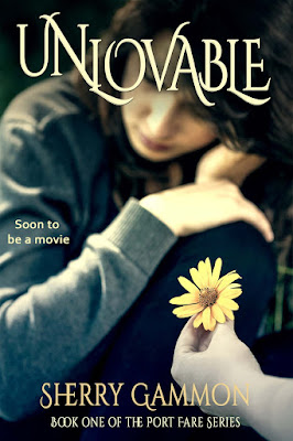
Over the years my novel Unlovable has changed. Not the story, (with the exception of fixing a few typos!), but the cover has!
This cover is my original cover. It is a photo of Central Park that I added a few effects to and called it good...Oh how naive I was! I sold a few hundred copies, but I knew that I needed to update the cover or all my hard work would be for not.

My next cover changed everything. I contacted a digital artist out of
England named Paul Beeley. I'd seen his work and was impressed. I told him what I was looking for, and together we created this cover. That changed everything! My book was picked up by several big book bloggers, received wonderful reviews, and caught the eye of Films By Serendipity who is currently making Unlovable into a movie! So it seems people may judge a book by its cover, at least at first. If the inside doesn't hold up, then the world's most incredible cover won't help at all.
However, according to the powers that be,(the big five publishers) changing book covers helps to draw in new readers. One cover may connect with someone, whereas another may not. When I recently updated the cover to Unbelievable from this:
Since so many people were now copying my cover I decided to freshen up Unlovable to this: (Yes, I now design covers!)
I LOVE these covers and am seriously debating whether or not to completely change Unlovable's cover. I love the girl on the swing and feel people connect it with Unlovable, but I wonder if a new look altogether might be better.
PLEASE comment below. Should I change the cover, or stick with the blue girl on the swing? And of the two new suggested covers, which do you prefer?
Thanks for stopping by!


I love the new design with the girl on the swing with the bluish forest in the background. I love the colors but it still holds the same message that Maggie is suffering in silence.
ReplyDeleteGood point! Hadn't thought of that. Thanks!
DeleteThis book was one of the very first books I ever purchased on my Kindle back in the day and so I know my opinion might be a bit biased but the girl on the swing just is this book for me. That cover grabbed my attention because it was like art. It makes me want to know what this book is about and frankly it's different, unique, emotional. To me, to change it to the others takes a way from that a little bit. It won't stand out.
ReplyDeleteGreat book by the way!
Thank you! I've gotten a lot of responses similar to yours. I wish I could have 2 covers like the big names...aka Stephenie Meyers, but I can't :/ Think I'll stick to the swing! Thank you again!
DeleteThe girl on the swing was the only thing that caught my attention To buy the book. Please don't change the cover!!!!
ReplyDeleteI've received many comments like yours. The girl on the swing is staying! Thanks for your input!
Delete